
Coca-Cola has the scripted font, McDonald’s has the golden arches, and Apple? well, an apple. A logo is fundamental to marketing your business. But, logo design is not something to be taken lightly. In fact, logos are multifaceted in their interaction to the consumer. For example, Coca-Cola’s scripted logo gives the familiarity of hand-written words while also indicating that the drink is cool and refreshing. The style of the logo makes you want to say “aaahhhhh,” a reaction that was surely intended by the logo’s designers.
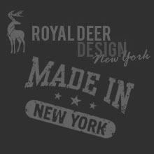
Simple logo designs by Royal Deer Design
So, what is it that makes a logo effective? This article will elucidate that topic and help set you on your way to successful logo design for your own business.
An effective logo is (in no particular order) simple, memorable, timeless, versatile, and appropriate. Many of these attributes interact with one another. Sometimes this interaction is difficult to separate and define in isolation.
Simple: A simple logo design allows the consumer to easily associate it with your business. Effective logos feature something unique without being overdone. The image is strong and balanced- not crowded with little extras that clutter its look.
Memorable: Memorability and simplicity often go hand in hand. A memorable design is distinctive and bold, making it easy to see at a glance. It also communicates your business clearly.
Timeless: When creating a logo and brand identity, leave trends to the fashion industry. An effective logo will endure the passage of time. What are your company’s values? Which symbols best communicate these values? Ask yourself if the logo will still be effective in 10, 20, 50 years.
Versatile: An effective logo should be functional across a variety of mediums and applications. It is generally done in an easy-to-read font. One should be able to adjust the size of the logo’s image without losing its clarity; it should be functional in both horizontal and vertical formats. It looks good in black and white, as well as in color. Starting with a logo that is designed in black and white will allow one to focus on the logo’s concept and shape. Black and white images are also easy on your budget; in printing your logo, the more colors used, the more expensive it will be for your business in the long term.
Appropriate: The graphic imagery of your logo should work well with your company name while looking appropriate for your business genre. The font, color scheme, and overall look should be designed with the intended purpose and audience in mind. For example, logos for children’s products should incorporate child-like fonts and themes. Likewise, a logo for adult products of services should incorporate more mature aspects in its design.
![]()
It is also interesting to note that a logo doesn’t need to show the specific product of a business or the service it offers. Furniture store logos don’t need to show furniture, appliance company logos don’t need to show graphics of an appliance, car logos don’t need to show cars, and computer logos don’t need to show computers. The Dr. Pepper logo isn’t a drink, nor is the Verizon logo a mobile phone. A logo is solely for identification.
In time, your logo will become synonymous with the quality of service your business provides. Take the time now to ensure it is designed with quality and care.