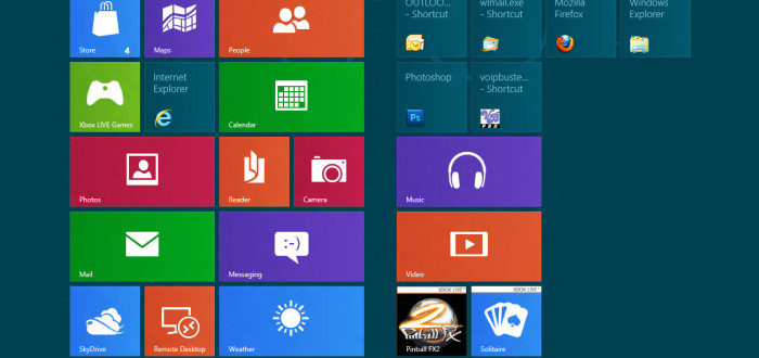
The digital world is already familiar with flat design. It was not until the mid 2000’s that flat design (also known as Metro design) started be used in web design. Flat design’s goal was to achieve simplification and rely more on typography, instead of relying on graphics.
Pros/Cons of the Flat Experience
Flat design consists of a few key components that make this design so simplified.
Improving the user experience has always been a major goal. Once gradients, patterns, textures, and shadows are added into a design, it can become very cluttered and messy. Simplistic design elements are the main focus of flat design.
Content must be high caliber, otherwise a user could get bored quickly. Distractions are not the sole focus of the design that is why making sure any type of content is well put together.
Flat design is very popular with mobile apps, however one concern that arises is being able to match color palettes to existing designs.
The selection of the best fonts for pairing is another must for flat design. Every time a font pair is chose, it has to be ideal. The reason for this is the degree of impact of the font and whether or not is the wrong choice of font for the site design typography.
Skeuomorphic design is optimized by flat design because of its amazing ability to create illusions with the end result of an “idea”. Skeuomorphic design is great for discouraging boredom in flat design UI.
Ultimately – flat design is a trend that will stick around for a long time. The goal for this user interface is to improve the users’ experience and keep the design simplistic which is optimal for both websites and mobile apps.


